This is Wet & Wild Femme Fatale with Petites Black Diamond as accent. These are two polishes I put in my swap/donate pile, but thought I should be thorough and try them again.
Black Diamond is more holo in real life. Probably still not as holo as the good version of CC Revvvolution, but I don't have that polish to compare.
I stamped with plate m64 and reversed colors.
Taking these out of the swap pile because they're pretty good for stamping. The only problem is Black Diamond ignited for me a huge lemming for Revvvolution. D'oh!
Showing posts with label pink. Show all posts
Sunday, November 13, 2011
Thursday, November 10, 2011
Pink Leopard Palate Cleanser
Or maybe pink cheetah. Actually, no clue. I just felt a bit overwhelmed with the bold colors these past weeks. The base is Revlon Lilac Pastelle, 3 coats. It's a light pink with blue undertones. I did not even bother taking a picture by itself because it bubbled a lot. I stamped with plate m57, and China Glaze Recycle which isn't really a good stamping polish but it works. Then I dotted the spots with Sally Hansen Nail Prisms Diamond.
A thin layer of Diamond seems to be holo, even in low light. Curious. I love studying polishes by way of frankening, and Diamond has now moved its way to the top of that list.
Someone make a polish that looks exactly like the nail prisms label?
A thin layer of Diamond seems to be holo, even in low light. Curious. I love studying polishes by way of frankening, and Diamond has now moved its way to the top of that list.
Someone make a polish that looks exactly like the nail prisms label?
Friday, November 4, 2011
From the Vault: Wet n Wild Waves of Enchantment
This is my favorite Wet n Wild ever!! It's similar to OPI Rally Pretty Pink but I love this shade so much! I think it's because the metallic particles are larger? I even used this as the main ingredient for a skittles franken I made a while back before I knew it was hard to find. But I don't like frankening with hard to find polishes. /sad panda
The formula is so good! Shown is two coats plus topcoat.
The only thing I didn't like was the stiff brush. It made for wonky application near the cuticle, but that has to do a lot with user error as well.
Ahhhh! If Wet n Wild wanted to make this world a better place, they would 1) make their LE polishes easier to find! 2) make Waves of Enchantment a core color!
The formula is so good! Shown is two coats plus topcoat.
The only thing I didn't like was the stiff brush. It made for wonky application near the cuticle, but that has to do a lot with user error as well.
Ahhhh! If Wet n Wild wanted to make this world a better place, they would 1) make their LE polishes easier to find! 2) make Waves of Enchantment a core color!
Wednesday, July 13, 2011
Better Together + Not So Blueberry
Okay, I started off with three coats of Essie Better Together, no topcoat. I generally avoid pinks but I love milky polishes.
I stamped with Revlon Not So Blueberry and mash plate m78. The lovely Kris from http://mylucidbubble.blogspot.com/ gave this to me but it doesn't want to photograph correctly so I haven't done a proper post on it yet. x.o
For whatever reason, my camera caught the purple and mild teal duochrome this time. Yay! Oh, that gives me an idea.
No topcoat. I like the contrasting finishes.
Sunday, July 10, 2011
Orange Pink Franken
Oops, hi. I meant to post this Friday, but I melted instead. /wicked witch of the mid Atlantic
I took these pictures a few months ago, but if I don't post this now I may never post it. haha
All of these were taken in natural light except the second one which was taken in sunlight.
Two coats + topcoat.
Facing the light source:
In the other direction it's pink... Okay, this one didn't photograph well. The pink is all in the shimmer which you can kind of see if you click and enlarge. Anyway, the shimmer doesn't hide in real life.
This is roughly 45% Sinful Colors' Bali Mist, 45% Sinful Colors' Courtney Orange(a shimmery orange-red), and 10% Wet n Wild Goldmine (gold shimmer).
I took these pictures a few months ago, but if I don't post this now I may never post it. haha
All of these were taken in natural light except the second one which was taken in sunlight.
Two coats + topcoat.
Facing the light source:
In the other direction it's pink... Okay, this one didn't photograph well. The pink is all in the shimmer which you can kind of see if you click and enlarge. Anyway, the shimmer doesn't hide in real life.
The rest of the time it's an orangey coral.
Thursday, July 7, 2011
Sinful Colors - Bali Mist
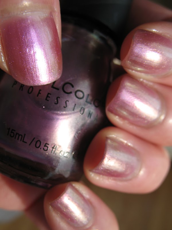
Sinful Colors - Bali Mist, 3 coats + topcoat.
This looks really purple and green in the bottle but on the nail it's like a metallic/opalescent pink. Actually, for whatever reason, this finish makes me a little bit nauseous lol.
See, purple green bottle. So pretty!
Even in low light the duochrome is weak. Luckily I read the MUA reviews and already knew about this, and I bought this intending to exploit its weakness. More on that tomorrow.
But first, just curiously, I stamped this over yesterday's mani. Subtle, but I like it.
*Blogger flipped my photos so they aren't all horizontal. I'm finding this rather disorienting. Anyone know how to fix it?
Subscribe to:
Posts (Atom)